KC's Fresh Fruit
& Smoothies
The Overview
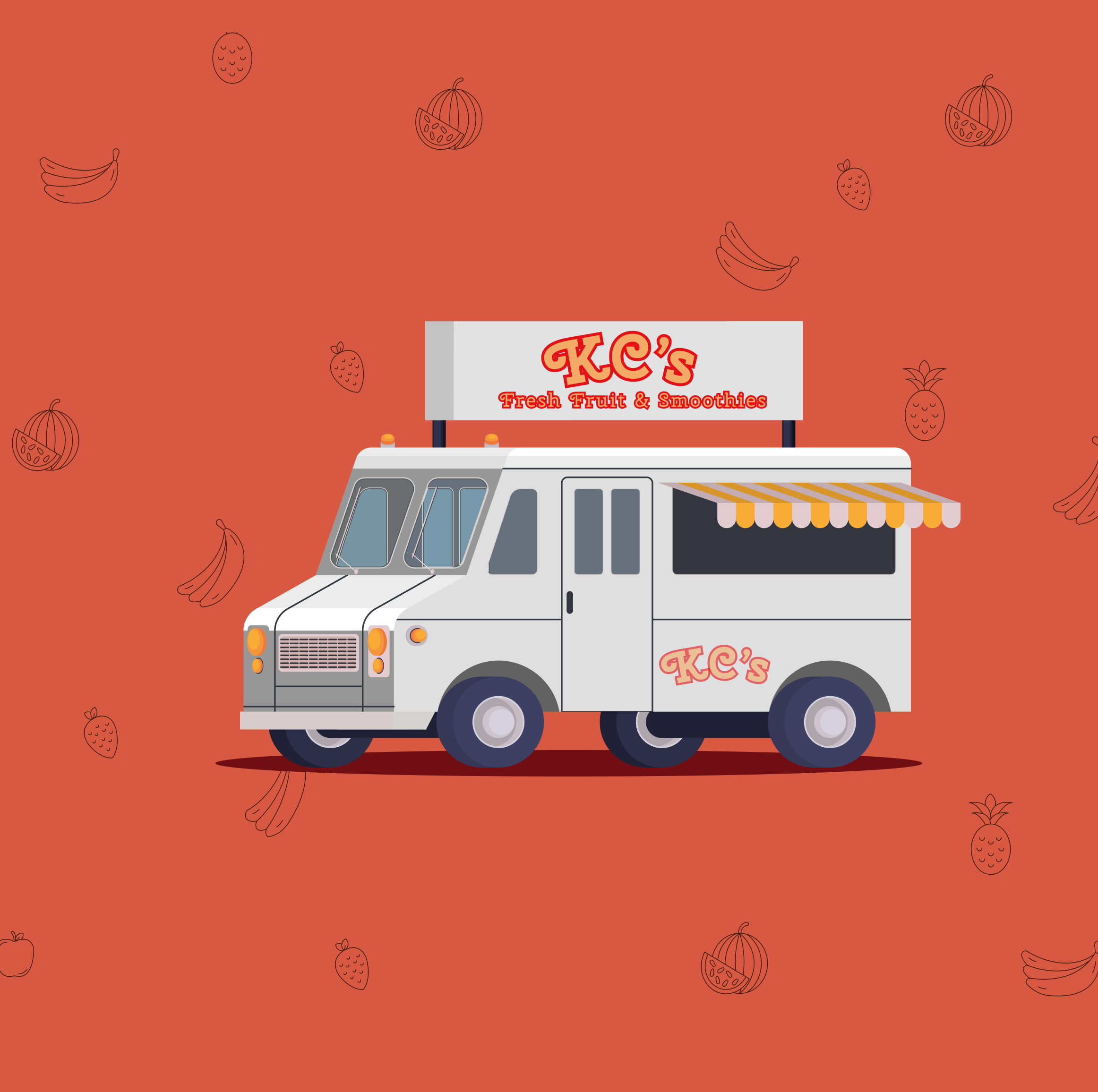
Kim Chan runs KC's Fresh Fruit & Smoothies food truck business around the Drexel campus. Her customers are mostly students running between classes, workers on their breaks, University Staff and Faculty, and commuters catching the trolley. The problem wasn't the smoothies. It was the wait, the uncertainty, and the friction of ordering at a window with no digital presence.
3 other designers and I collaborated as a team called 4 Corners and inherited the project and early prototype for KC's ordering app and rebuilt it from the foundation up, redefining the user research, establishing a visual identity grounded in KC's warm brand, and carrying the design through two rounds of usability testing into a fully functional website with a live database. The result is an ordering experience that gets customers their smoothie faster and KC her orders more clearly.
Rebuilt to reflect KC's actual customer base.
10 total participants across prototype and webpage builds.
Figma prototype to Static HTML Alpha to Database Structuring to Full production website.
Overall experience score across Round 2 usability testing.
The Team, 4 Corners
The Context & Challenge
KC's Fresh Fruit & Smoothies had built a loyal customer base near Drexel's campus on the strength of fresh ingredients and a personal touch. But as demand grew, so did the friction. Customers didn't know where the truck would be. Lines formed with no visibility into wait times. Payment required Venmo, cash, or fumbling for a phone with no dedicated app. For a customer base defined by limited time windows, these weren't small inconveniences. They were reasons to walk past.
The Problem
KC's customers — Drexel students and staff, nearby workers, and campus commuters — share one defining constraint: time. A student between classes, a worker on a 20-minute break, and a commuter watching the trolley schedule all need the same thing: to know their order will be ready before they arrive, without standing in line to find out.
Without a digital ordering system, KC was losing customers to faster alternatives, not because her product was worse, but because the ordering experience created too much uncertainty for time-pressured users.
Goals & Objectives
Build a mobile-first ordering experience that allows customers to customize and place orders before arriving at the truck.
Support frictionless payment through Venmo, Apple Pay, and credit card, removing the need to handle cash or stop to open a separate app.
Deliver a clean, short menu that helps users make a decision in seconds, with clear ingredient and pricing information.
Provide real-time order status so customers know exactly when and where to walk to the truck.
My Role
As Primary Designer and Secondary Data Architect on Team 4 Corners, my contributions spanned both the visual and structural layers of the project — from shaping how users understood KC's brand to ensuring the team's assets and data were organized for a smooth production pipeline.
Primary Designer
User Research
Rebuilt all three user personas and journey maps from scratch, replacing the inherited research with work that accurately reflected KC's actual customer base: students, nearby workers, and campus commuters.
Visual System
Supported the secondary designer who led the visual system. My contribution was providing input on component decisions and ensuring the direction aligned with the research findings.
Page Design
Contributed to the collaborative design of the team page and project page, helping establish the visual language for how the project presented itself to the class and others.
Usability Testing
Led both rounds of moderated usability testing: recruiting participants, facilitating recorded sessions on Zoom with think-aloud protocol, documenting findings, and translating feedback into prioritized design changes for each subsequent build.
Secondary Data Architect
Asset Organization
Defined and maintained the image and file folder structure across the project, establishing consistent naming conventions and a logical hierarchy for product images, UI assets, and team files so the codebase remained clean across all four team members.
Menu Data Structure
Contributed to structuring the menu data in Excel, organizing tables for menu items, customization options, and pricing.
The Process & Insight
Here is a breakdown of the work I personally led or contributed to across the project lifecycle, from the initial research rebuild through both rounds of usability testing and into the data structuring phase.
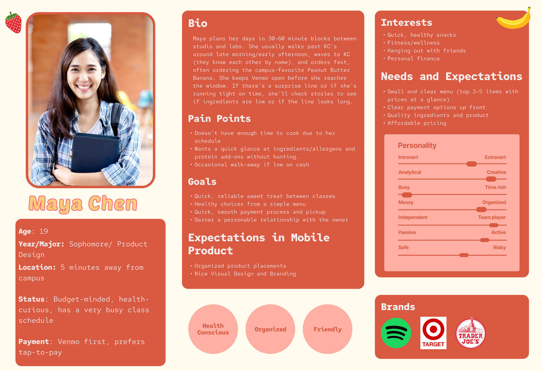
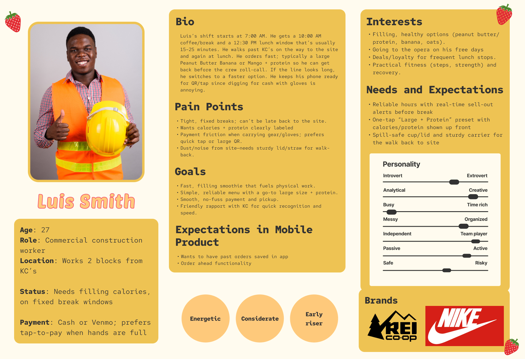
Rebuilding the personas from scratch
The project was inherited from a previous team with existing personas that did not accurately reflect KC's customer base. I rebuilt all three personas and journey maps entirely, grounding them in the real constraints of students, nearby workers, and campus commuters. This became the research foundation every subsequent design decision was checked against.
Six participants, Figma prototype
I recruited and facilitated a moderated usability test with 6 participants using the Figma prototype, running Zoom recorded sessions with think-aloud protocol. I documented all findings and translated them into a prioritized list of changes: fixing color contrast on ingredient buttons, correcting the selection limit bug, enlarging the order number, and adding more of KC's personality to the interface. These findings became the brief for the alpha HTML build.
Structuring the project file system
I defined and maintained the image and file folder structure across the project, establishing consistent naming conventions and a logical hierarchy for product images, UI assets, and team files. This kept the codebase navigable for all four team members throughout the build phases.
Four participants, Static HTML web version
I ran a second round of moderated testing on the live coded web application with 4 participants. The sessions surfaced new interaction-level issues that only emerged in the real browser environment: a non-functional tip selector, an abrupt Apple Pay transition, and missing payment method icons. I documented and prioritized these findings, which drove the final production build.
Organizing the menu data in Excel
I contributed to structuring the menu data in Excel, organizing tables for menu items, customization options, and pricing. This served as the structured reference for the primary data architect's database implementation.
Target Audience / User Personas
The redesigned personas are grounded in a single shared reality: KC's customers have limited time. The design had to work for all three: the student on a 10-minute class break, the construction worker who can't fumble with cash or tiny buttons, and the data science student who wants the app to learn his routine.
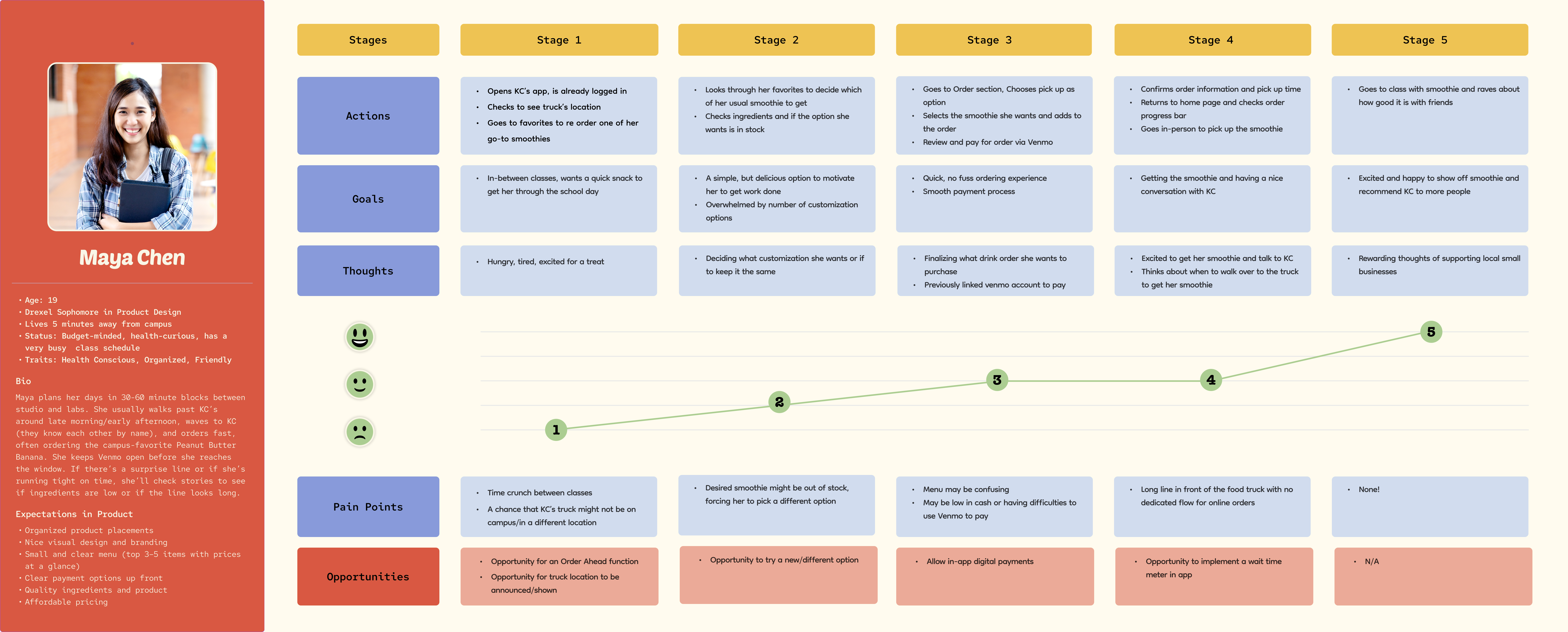
Maya Chen
19 · Drexel Sophomore · Product Design
Situation
Schedules her day in 30–60 minute blocks between studio sessions and labs. Walks past KC's regularly and has a go-to order. Always has Venmo open before she reaches the window.
Pain Points
- No way to confirm truck is on campus before leaving class
- Can't browse ingredients at a glance
- No order-ahead option means waiting in a line she can't afford
What the App Needed
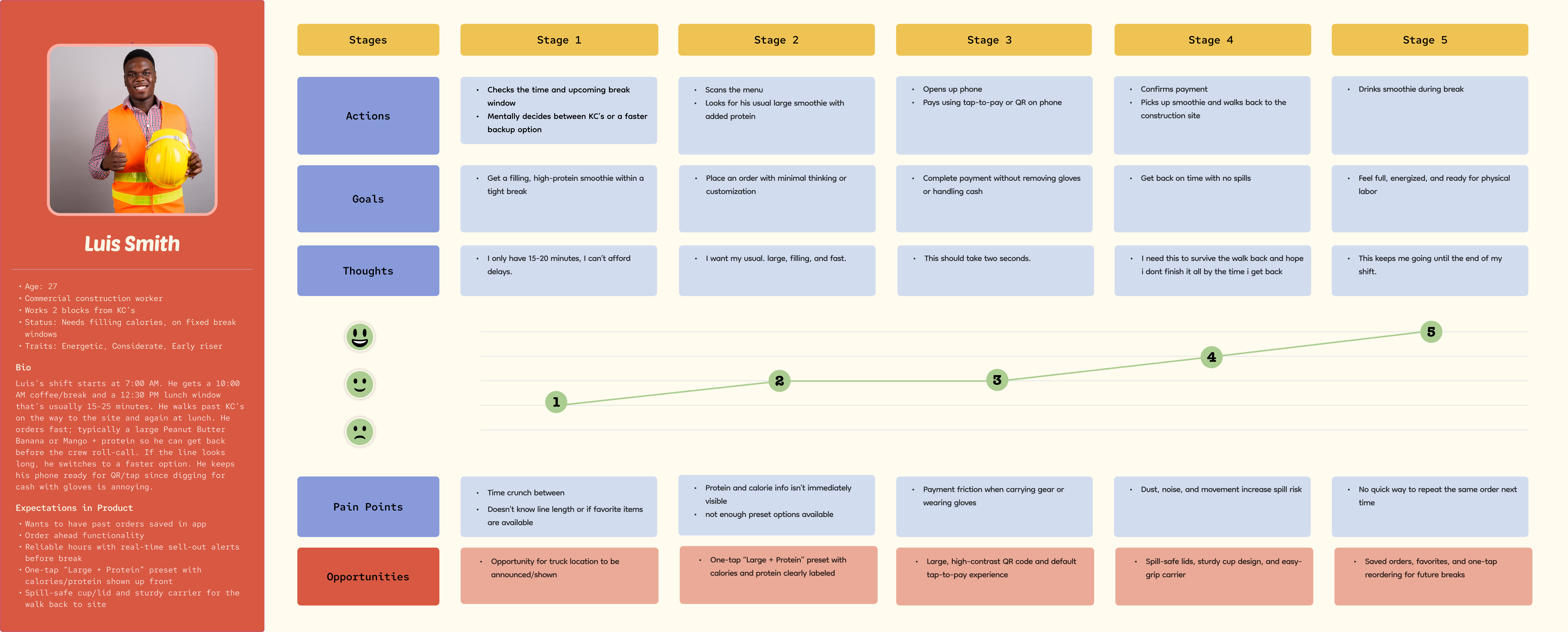
Luis Smith
27 · Construction Worker
Situation
Gets a 10 AM coffee break and a 12:30 PM lunch window, both under 25 minutes. Walks past KC's daily. Orders large with protein. Hands are often in gloves. Pulling out cash or navigating a complex UI isn't an option.
Pain Points
- Payment friction with gloves: cash and small buttons both fail
- Protein/calorie info not visible upfront
- No way to repeat the same order quickly
What the App Needed
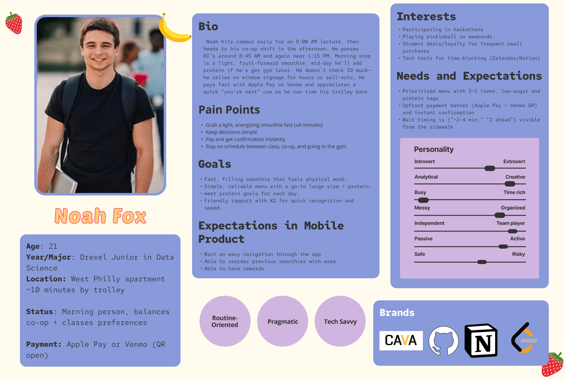
Noah Fox
21 · Drexel Junior · Data Science
Situation
Morning stop at KC's on the way to an 8 AM lecture, and again at 1:15 PM on the way to co-op. Routine-oriented and tech-savvy. Relies on window signage for availability.
Pain Points
- No wait time visible from the sidewalk or app
- Too many options make instant decisions impossible
- No queue position indicator after placing an order
What the App Needed
User Journey Maps
Journey maps were built for all three personas across five stages: Discovery to Browse to Order to Payment to Pickup. The emotional arcs were consistent; all three started at neutral or low confidence and rose sharply after successful payment. The key design implication: eliminate doubt early. If a user isn't sure their order went through, they've already had a bad experience.
Maya Chen
Luis Smith
Noah Fox
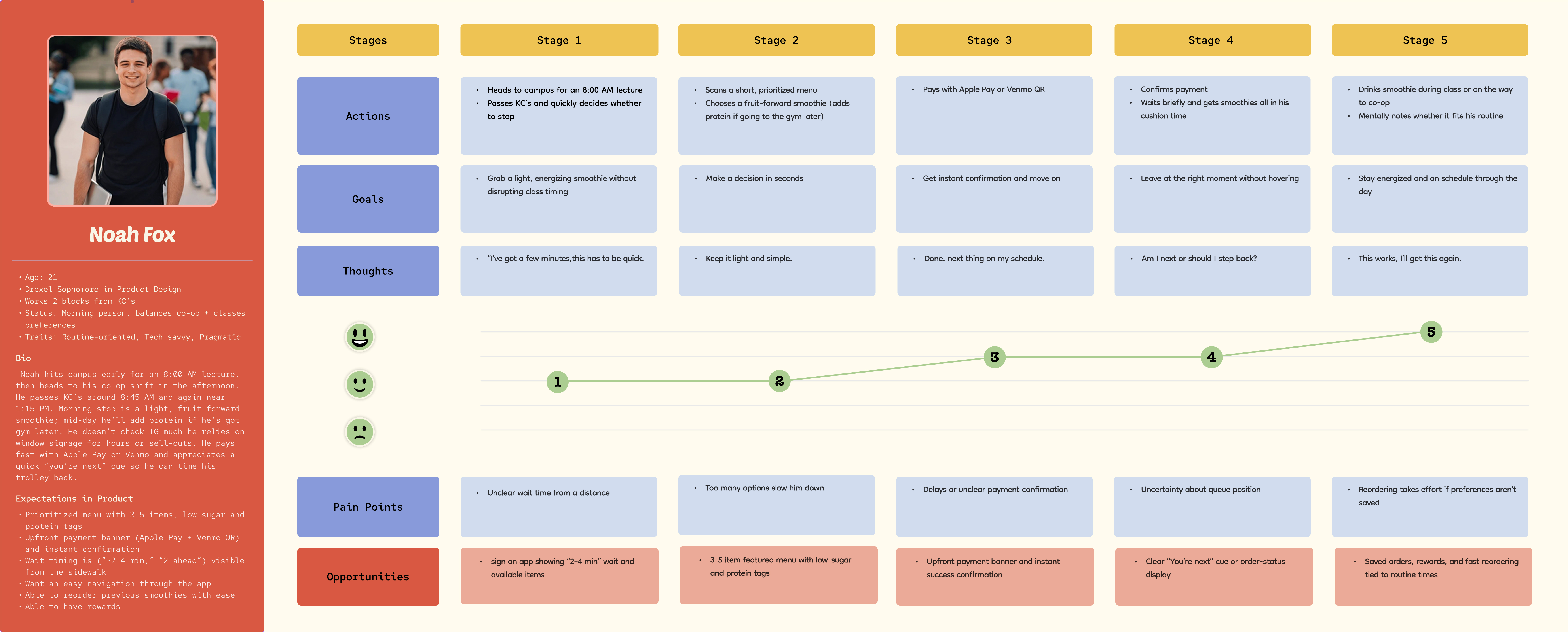
Cross-Persona Opportunities
- Order-ahead with saved order history
- Live truck location on the home screen
- Tap-to-pay via Venmo and Apple Pay
- Real-time order status after confirmation
Emotional Arc Insight
- All three personas start below neutral at Stage 1 (time pressure)
- Confidence peaks immediately after payment confirmation
- Stage 4 (waiting) drops if there's no visible order status
- Stage 5 (pickup) is the highest satisfaction point. Protect it
Design Priorities Set
- Short, curated menu: 4 items maximum visible on home
- Order number must be large enough to be called out
- Status screen must change color when order is ready
- Multiple fast payment methods with no friction at checkout
Visual System / Style Guide
The visual system was led by the secondary designer. I contributed input during key decisions. Every color in the palette has a job: coral activates on CTAs and selected states, periwinkle informs through secondary badges and selectors, yellow marks significance on featured tags and order confirmations, and the neutrals keep a customization-heavy interface readable without visual noise.
Color Palette
Typography
Usability Testing
Two rounds of moderated usability testing were conducted across the project lifecycle, one on the Figma prototype and one on the live static HTML web version. Each round surfaced distinct issues tied to the fidelity level being tested.
Round 1: Figma Prototype Test
Contrast failure on ingredient buttons
4 of 6
Felt branding lacked personality
5 of 6
Praised overall flow as intuitive
6 of 6
Order number too small
4 of 6
Color contrast failure. Black text on coral-selected ingredient buttons failed accessibility. Multiple testers flagged it independently.
Ingredient limit not enforced. The UI instructed users to "select up to 3" but allowed unlimited selections, creating a trust issue.
Order number too small. The confirmation screen's order number was described as "way too small" for KC to call out orders.
Branding too minimal. Multiple testers felt the app lacked personality — the interface is clean, but there's too much text and too little visual life.
Flow praised as intuitive. The step-by-step customization structure and receipt-style confirmation were described as "fun," "easy to follow," and "exactly what I expected."
Round 2: HTML Web Test
Praised ingredient icons
4 of 4
Tip selector confusion
3 of 4
Unsure if Apple Pay processed
2 of 4
Payment icons missing
4 of 4
Ingredient icons praised by all testers. Added between rounds in response to Round 1 feedback. One tester said they made the customization page "feel like food, not a form."
Tip selection non-functional. Testers couldn't interact with tip options; the page jumped directly to confirmation, creating confusion about whether a tip had been added.
Apple Pay transition felt unconfirmed. After tapping Apple Pay, the jump to the confirmation screen was described as abrupt. One tester said they wavered, unsure if the payment had processed.
Payment method icons missing. The web build omitted brand icons for Apple Pay, Venmo, and credit card. Recognized payment method logos are critical trust signals at the highest-friction point in any ordering flow.
Order number button easy to miss. Testers wanted a physical progress bar or more prominent visual cue to understand order status over time, not just a static number.
Design Iterations
The gap between a prototype and a product is closed by acting on what testing reveals. Here is what changed at each stage, and why.
Prototype to Static HTML
Driven by contrast, clarity, and personality findings from Round 1 testing.
- Corrected color contrast on selected ingredient buttons
- Added ingredient icons throughout the customization screen
- Enforced 3-ingredient selection limit in UI logic
- Enlarged order number to full-width banner on confirmation
- Added KC's branding elements and product photography
Static HTML to Production site
Driven by functional and trust failures surfaced in the web context.
- Fixed tip selection interaction: functional toggle with selected state
- Added payment method brand icons (Apple Pay, Venmo, card)
- Improved Apple Pay to confirmation transition with loading state
- Added ingredient details to receipt and confirmation screens
- Introduced size icons to match ingredient icon treatment
Live Functional Site
All workflow paths implemented with a live database backend.
- Live database powering menu items and customization options
- Dynamic pricing: size and add-on selections update total in real time
- Full order management with status transitions
- Order history accessible via History tab
- Persistent bag state across navigation
The Solution
The final product is a mobile-first website that takes a customer from ordering to pickup in under two minutes. Every screen was designed to reduce hesitation at the moment research told us hesitation was most likely to occur.
The Results
The final application delivers on every goal established at the outset. Customers can now order ahead, pay without friction, and know exactly when their smoothie is ready — without standing at the window. KC receives clear, numbered orders with complete customization details, reducing miscommunication and improving throughput during busy periods.
4.75 / 5 Overall Satisfaction
Average overall experience rating across Round 2 usability testing, up from 4.4 in Round 1. Testers described the final web version as "visually pleasing," "easy to navigate," and "clear without being boring." Every critical workflow path completed without assistance.
Zero Critical Blockers in Round 2
Every Round 1 critical issue — contrast failures, ingredient limit bug, and illegibly small order number — was resolved before Round 2 testing. Round 2 findings were limited to interaction-level refinements, not fundamental UX failures.
Ingredient Icons: A Design Win Confirmed
The addition of ingredient icons between rounds — a direct response to tester feedback about the interface feeling text-heavy — was praised by all four Round 2 participants. One described them as making the page "feel like food, not a form."
Full Production Build Delivered
The final deliverable is a working website with a live database, complete order management, dynamic pricing, and the full critical workflow path from home screen to order pickup. The project moved from an inherited Figma prototype to a deployed website across a single term.
Lessons Learned
Rebuild research before building anything else. The inherited personas didn't capture the time constraints that defined every user on this project. Rebuilding them first meant every subsequent decision had a real user need behind it, not an assumption.
Test at every fidelity level. The prototype test and the web test surfaced completely different issues. Figma hides interaction logic. The browser reveals it. Testing once would have left functional failures in the final product.
Color has to do a job, not just look good. The contrast issues discovered in Round 1 were a reminder that every design choice in an interface carries functional weight. The color system was redesigned to make state unambiguous at a glance.
The order number is KC's interface, not just the customer's. One of the most valuable testing insights: the confirmation screen serves two users simultaneously — the customer needing receipt confirmation, and KC needing to call out a clearly readable number from across a truck window.
Third round Usability Testing. If the timeline was extended, I would have loved to conduct a third round of usability testing on the final build just to get feedback on the overall experience.


